This is a video I created that features the music videos that we were inspired from and shows what we did. I thought it would really allow to compare and contrast and supports Kristeva's argument that texts are based on other texts.
Friday 31 March 2017
Summary: Where we got our inspiration from
This is a video, which I created to show a clear video of where we got out main inspiration points from. I have also created another video that compares our inspiration music videos to what we did.
Podcast 23
SR
This is our 23rd weekly podcast. This week we focused on media theories for our written exam and started planning our evaluation questions. Bronwen worked on getting the digipack done, whereas Kristian worked on trying to include the newsfeed on our website by downloading several templates. I created rough cut 16, which should be a final cut next week. Next week, we will also film for our evaluation questions and we intend to have a final version of our entire package including digipack, video and website.
Digipak Unwrapping
This is an unwrapping of the digipak that Kristian and I created. There are 2 seperate videos. One where Kristian is pretending to be Matt from BMTH, the bass guitarist and one where I am playing a fan who is unwrapping the digipak for the first time, after I bought it at the HVM store.
This is Kristian acting as Matt.
This us the video of me, acting as a fan.
This is Kristian acting as Matt.
This us the video of me, acting as a fan.
Thursday 30 March 2017
Production Schedule UPDATE 12
This is Production Schedule Update 12, which I created. In this production schedule I added several dates for rough cut 14, 15 and 16 and I changed the date for the final cut to the 4th of April.
BV: DIGIPAK: Complete Final Version
This is the final version of the digipak. After getting feedback from my teacher, I have added the following details:
- I sharpened the opacity on the barcode to 100%. I did this because in every example I found, the barcode is sharp.

- I added some bonus tracks to the track listing. As this is a compilation album, it is important to add new unreleased tracks or new versions of songs in order for there to be a reason to buy it, as all the other tracks are on previous albums. The names for these tracks are "BORN", "DIRT" and "THE FIELDS" I like these names as they fit in really with the other grungy titles of their songs, and therefore also fit well with the genre.

-I made the "BMTH" on the spine a lot smaller and put it after the band name as this is much more common that it being before. I also added the SONY logos. and a catalogue number.
- On the front cover, I added a sticker that says "Featuring 3 Exclusive New Tracks" as this will draw attention to the new content and therefore attract the audience to buy the Digipak. I did this in a dark bluey/grey colour as I wanted it to stand out from the black and white colour scheme but also flow well altogether as a whole.


Evidence of Directing
This is some evidence of directing that I created. It combines several different takes from different scenes where I was directing.
Wednesday 29 March 2017
Rough Cut 16: Throne
This is rough cut 16, in which I worked on the fast paced sequence when the first beat drops. I put the narrative in black and white because it focused too much on the shot, since it was so much brighter than the other shots used. The next cut will be a definite final cut, since our audience feedback from our teacher was that everything was good except for the fast paced sequence in which I should make the takes longer rather than 4 miliseconds and I should take out the dark shot of the wood running sequence, because it made it look as if I had cut it to black in final cut.
Friday 24 March 2017
Podcast 22
This is our 22nd weekly podcast. This week I edited together our rough cut 15 and we got audience feedback for it. Also, we filmed some more narrative with our female protagonist burning the pictures of her and our male protagonist Wayne. And I included this in our music video. Also, we focused on getting our social media accounts done, so I created some more posts and Kristian will try and include this social media on our website next week so that our website will be done as well. Next week we will all be working on Evaluation Questions and Bronwen will work on getting the digipack done, and I will try and get a final cut done.
SR
Audience Feedback 11: Rough Cut 15: Throne
This is some audience feedback that we got for our rough cut 15. The video was said to be pretty much done and our teacher argued that all that still needs to be looked into is the fast paced sequence. Also, another student said that in the fast paced sequence one shot was standing out too much, which might be because of the difference in lighting of the dark performance and the bright narrative.
Thursday 23 March 2017
Rough Cut 15: Throne
This is rough cut 15 that I edited after having gotten audience feedback from our teacher. In this version I have tried to achieve good instruments verisimilitude. Also, I have focused on the points my teacher mentioned in the audience feedback such as removing the layer behind the flickering effect and trying to layer the pool shot onto other shots. However, the pool take was too short and so I couldn't put it over 5 shots. Therefore I decided to put it in as a separate shot and not layer it.
Wednesday 22 March 2017
Reflection on Narrative Shoot 3
Kristian and I filmed some more narrative scenes, after having gotten audience feedback that our narrative was a bit thin, because we didn't have enough scenes of our two character's so that our audience could get to know them.
 Overall it went really well, we wanted to include some more scenes of them being happy together, which we did by filming some scenes of them cooking together and smearing cream on each other's faces. It was quite hard to film, because the actor's autmatically moved out of frame, which meant that we had to film 3 scenes in total and they had but in the end we managed.

For the polaroid pictures, we asked our two actors to take some selfies of themselves with out phone after, which we printed them out as the sterotypical polaroid picture. We chose polaroids because we would be able to attract a young female audience, due to the resurgance of polaroid pictures lately.
Web 2.0
Web 2.0 - The shift from a passive up to down model to a dynamic convergence between audience and producer. Interactivity enabled by convergence.
The idea of Web 3.0 is the dominance of UGC, that the audience now has become the dominant producer.
The idea of Web 3.0 is the dominance of UGC, that the audience now has become the dominant producer.
What I would include in the exam:
Applying Stuart Hall's concept of a clear preferred reading was very difficult, since we were 3 members in our group.
Dan Gillmor writes of "the former audience", suggesting that a passive audience is gone and that the audience now have "the tools to challenge traditional media and create media for themselves".
Through several hours spent with our audience, we gained a large variety of audience feedback, our audience ended up as playing the "producer" of our music video too. They had a great impact on what we changed in our music video. Some things they argued included bad lip-syncing, not achieving versimilitude. Lip-syncing is one of the common conventions of music videos and should therefore also achieve verisimilitude in a music video.
Another argument our audience brought up was that there should be a clearer narrative. At the beginning we had a fragmented narrative, which our audience argued was confusing, which then didn't bring the preferred reading (Stuart Hall) accross. They suggested we should have a linear narrative containing more footage. Hence, our audience feedback actually led to us having to do a re-shoot of our narrative. After having done that, we got the preferred reading from our audience that we wanted. Our narrative storyline follows a male protagonist who is depressed and drowning in his sorrows and that he used to be together and happy with a girl (our female protagonist). We have denoted this "happy couple" by having footage of them laughing together, hugging each other and cooking together and denoted him having sorrows, by filming him under water, which is an intertextual reference to the music video Runnin' by Naughty Boy ft. Beyoncé . However, we also got this idea when brainstorming of what we should film and putting our storyboard and call sheet together. Andrew Goodwin argues that one of the 6 main features of a music video is a link between the visuals and the lyrics. This doesn't necessarily have to be there but comes accross nicely for the audience, because it is illustrative and allows them to relate to the male protagonist.
Tuesday 21 March 2017
Audience Feedback 10: Throne Rough Cut 14
This is some feedback I got for the rough cut 14 from our teacher. If these are done, then the next one should be the final cut.
1.16 the fist seems a bit too much, try to layer with something else where he is not singing
1.20 try and put the cream fight in slow-mo and keep the pool shot layered until 1.26
1.35 reverse the shot of the singer jumping and the singer running
1.44 cross-cut the shot of the layered guitarist
Question 1B
For our question 1B in our exam we have to apply concepts and theories of media language to our own music video.


A long group shot (5 people) of the band. The band is composed of just male members and we are conforming to the stereotype that rock music only consists of male band members. Simple mise-en-scene, members all have tattoos and are wearing dark clothes. Non-objectified female protagonist in the narrative later, so not just focused on male characters. You can identify with the band members if you are younger. The short hair of every band member is normative nowadays. However, 20 years back long hair was part of metal. The drummer has a very evident beard, which fits together with his fast paced drumming. This doesn't look like a boyband, because they have tattoos, beards and are therefore no completely desexualised. The singer in this band counters the hegemonic norms on the masculin side of things, because he shows emotions very heavily, because he is singing about his girlfriend and arguably it is a love song. It is about the pain he feels, which makes it counterhegomonic to the masculin normative.
 Opens the door for her, which is the stereotype of a gentleman, but isn't the normative nowadays.
 The dirt on the shoes represents the genre of rock, because it goes against the normative of perfect beauty. With men there is not as much focus on beauty and clean shoes. There is rule of thirds and the foot is centrally framed and is therefore what the audience will focus on.

 There is an equivalence between the male protagonist and the female protagonist, no strong binary, because there are both having an ice cream or a smoothie and are both wearing tight jeans.
The one and only thing that would be a binary opposition in this shot would be the long hair of the female protagonist and the short hair of the male protagonist. The frozen yoghurt is a representation point because you would typically expect a bar with alcohol and smoking, because it is metal genre. Iconic image
of someone like Lemmy is alcohol and a bottle of Jack Daniels for the metal genre. This is somewhat different compared to frozen yoghurt and smoothies.
 If the guitar wouldn't be there the focus would be on his groin. However, because the guitar is there, the groin is framed but not for sexualised purposes, which it would be in thousands of other music videos.


 There is an equivalence between the male protagonist and the female protagonist, no strong binary, because there are both having an ice cream or a smoothie and are both wearing tight jeans.
The one and only thing that would be a binary opposition in this shot would be the long hair of the female protagonist and the short hair of the male protagonist. The frozen yoghurt is a representation point because you would typically expect a bar with alcohol and smoking, because it is metal genre. Iconic image
of someone like Lemmy is alcohol and a bottle of Jack Daniels for the metal genre. This is somewhat different compared to frozen yoghurt and smoothies.

Production Schedule UPDATE 11
This is production schedule update 11 in, which nearly all our tasks are now complete, except the final cut. One change is that I have added a date (24th of March), of when the Final Cut should be done.
Rough Cut 14: Throne
This is rough cut 14 in, which I included the footage of our female protagonist burning some pictures of her and the male protagonist. I think the next cut will be our final cut.
Saturday 18 March 2017
Production Schedule UPDATE 10
This is update 10 of our production schedule, which shows that we filmed the narrative scenes and created rough cut 13, but will film more narrative scenes of burning pictures on Tuesday the 21st of March and upload rough cut 14 with this new footage
Friday 17 March 2017
KO: PROPS: Polaroid Pictures
 After they break up we wanted the female protagonist to burn some photos that where taken when they where together. We wanted to burn Polaroid pictures as this was more fitting for a couple stereotype. We got the actors to take selfies using an iPhone 6 which we filmed them doing. Then to get the Polaroid pictures we printed them out using a Bluetooth Polaroid Zip Instant Printer.
 https://www.youtube.com/watch?v=lKda-8GlY_A
Rough Cut 13: Throne
This is rough cut 13, in which we included the new narrative footage that we filmed on Thursdsay the 16th of March, as stated in Production Schedule UPDATE 9. Besides the new narrative there are no major changes to it and we will film our female protagonist burning the pictures on Tuesday the 21st of March as stated in Production Schedule UPDATE 10.
SR/BV: DIGIPAK: Front Cover Final Version

This is the final version of the front cover, which we are all really happy with.
Below you can see a vodcast, which Bronwen created, in which she explains how she created the final version in Adobe Photoshop. She edited the vodcast using Final Cut Pro X on our Mac's in school. While she was working in photoshop, she took screenshots along the way, using cmd alt and 4 so she could select and control exactly what she was taking screenshots of.
Wednesday 15 March 2017
Inspiration: What we did
OUR INTERTEXTUAL REFERENCES
We have some intertextual references to several music videos, which we have gotten our inspiration from. One of them includes the reference to the color powder in the music video by the band 30 Seconds To Mars, track Up in the Air.
 When I blogged on this music video back in October, I immediately knew that I really wanted us to include color powder in our music video's. At the beginning we wanted to have footage of 20 people running at each other and throw the color powder at each other, which they do in the Up In The Air music video.
However, we quickly discovered that it would be very hard to get so many people together, especially because the first throw we would only be able to film once in order for them not to have color powder on their whole body for the sake of continuity.
Therefore we decided to have the color powder thrown at the male protagonist, the drums and we might still throw it at some of the band members, because it has become so popular and we got a lot of good feedback for it in our audience feedback sessions.
Another intertextual reference is the one we have for our underwater pool scenes. This we got from two different music videos. One of the videos is by the band Panic at the Disco for their track This Is Gospel. Whereas the other video we were inspired from is the video by Naught Boy ft. Beyoncé for their track Runnin'.

 These are images of the two different music videos. The 1st picture is from This is Gospel, where the leadsinger is under water. This was filmed inside a box. At the beginning we intended to film our underwater scenes in a bathtub like this (left). However here again we found out how difficult it would be, because it would be hard just to have a GoPro stuck in a small bathtub with the leadsinger and it wouldn't look half as good as if it was in "open waters".
 This is when we came up with the idea for a pool, which we as mentioned above, got our inspiration for from the track Runnin'. We didn't have an open ocean around Luxembourg and it was not summer, but we did have a heated pool and could put some effects on it so that it would look more ominous than the usual light pool blue.
 This is the result we ended up with. We filmed under water with the waterproof GoPro and were able to see it at the same time due to the advantage of the newer versions of the GoPro having a screen where you can see what you record. We got shots of the pool empty and the pool with our male protagonist in it and we think it worked really well and managed to connote the darkness of the lead singer and his dark thoughts and that he feels as if he is drowning in his own sorrows and thoughts.
Bronwen has a detailed post on the This Is Gospel video, whereas I created a post on Runnin'. In my post: reflection on pool shoot, you can read more about the intertextual reference.
 Another intertextual reference in our music video is the one to Twenty-One Pilots track and music video for Ride (top right picture). We thought that it had a really nice natural effect when having the instruments outside, than having our band play in a normal studio with a green screen background.
 Some challenges we faced in the woods included our re-shoot and the fact that it was really cold outside, since we were filming during January.
When doing the re-shoot, the instruments had to be placed on the exact same spot, for sake of continuity, and it was becoming really cold for our band members, because they were (most of them) only wearing T-Shirt and/or thin jumpers for mise-en-scene. So when we filmed someone like the drummer on his own or the keyboarder, or the drummer with bass guitar etc. the other's were sitting inside a car so that they wouldn't cool down entirely. Despite the challenges faced, we are very happy with the result, since a lot of the audience who watched it, like the fact that it was outside in the woods and were impressed with the fact that we had taken all of the instruments up there for the purpose of our music video.

 A last intertextual reference we have in our music video is the one from the music video by Alt-J for their track Hunger of the Pine, which Kristian did a post on. In this music video there is a running sequence, which we also have in our music video. We liked the running sequence, since by using it in our music video we wanted to connote that our male protagonist is trying to run away from his problems and try to think about something else while running. We filmed this using a GoPro, an IPhone 6S for the slo-mo and the CANON 70D for the other long-shots.
We have some intertextual references to several music videos, which we have gotten our inspiration from. One of them includes the reference to the color powder in the music video by the band 30 Seconds To Mars, track Up in the Air.

However, we quickly discovered that it would be very hard to get so many people together, especially because the first throw we would only be able to film once in order for them not to have color powder on their whole body for the sake of continuity.
Therefore we decided to have the color powder thrown at the male protagonist, the drums and we might still throw it at some of the band members, because it has become so popular and we got a lot of good feedback for it in our audience feedback sessions.

 These are images of the two different music videos. The 1st picture is from This is Gospel, where the leadsinger is under water. This was filmed inside a box. At the beginning we intended to film our underwater scenes in a bathtub like this (left). However here again we found out how difficult it would be, because it would be hard just to have a GoPro stuck in a small bathtub with the leadsinger and it wouldn't look half as good as if it was in "open waters".
 This is when we came up with the idea for a pool, which we as mentioned above, got our inspiration for from the track Runnin'. We didn't have an open ocean around Luxembourg and it was not summer, but we did have a heated pool and could put some effects on it so that it would look more ominous than the usual light pool blue.
 This is the result we ended up with. We filmed under water with the waterproof GoPro and were able to see it at the same time due to the advantage of the newer versions of the GoPro having a screen where you can see what you record. We got shots of the pool empty and the pool with our male protagonist in it and we think it worked really well and managed to connote the darkness of the lead singer and his dark thoughts and that he feels as if he is drowning in his own sorrows and thoughts.
Bronwen has a detailed post on the This Is Gospel video, whereas I created a post on Runnin'. In my post: reflection on pool shoot, you can read more about the intertextual reference.
 Another intertextual reference in our music video is the one to Twenty-One Pilots track and music video for Ride (top right picture). We thought that it had a really nice natural effect when having the instruments outside, than having our band play in a normal studio with a green screen background.
 Some challenges we faced in the woods included our re-shoot and the fact that it was really cold outside, since we were filming during January.
When doing the re-shoot, the instruments had to be placed on the exact same spot, for sake of continuity, and it was becoming really cold for our band members, because they were (most of them) only wearing T-Shirt and/or thin jumpers for mise-en-scene. So when we filmed someone like the drummer on his own or the keyboarder, or the drummer with bass guitar etc. the other's were sitting inside a car so that they wouldn't cool down entirely. Despite the challenges faced, we are very happy with the result, since a lot of the audience who watched it, like the fact that it was outside in the woods and were impressed with the fact that we had taken all of the instruments up there for the purpose of our music video.

 A last intertextual reference we have in our music video is the one from the music video by Alt-J for their track Hunger of the Pine, which Kristian did a post on. In this music video there is a running sequence, which we also have in our music video. We liked the running sequence, since by using it in our music video we wanted to connote that our male protagonist is trying to run away from his problems and try to think about something else while running. We filmed this using a GoPro, an IPhone 6S for the slo-mo and the CANON 70D for the other long-shots.
Tutorial: Basic Tools on Photoshop
This is a screen recording I created when creating the T-Shirt of the wolf for our merchandise on our website. However, I thought I would just put it up as a Tutorial, since it shows the basic tools of photoshop.
Production Schedule: UPDATE 9
This is the 9th update of the production schedule, which I created. It includes the tasks that we have completed so far, and the ones which are still to be completed. I always like to use color coding since it gives me a great overview of what still needs to be done.
After last time it has changed quite a bit. First of all we have changed the name of our rough cut 1 draft 1, draft 2, draft 3 etc. to seperate rough cuts, now being called rough cut 1, rough cut 2 etc.
Secondly, we need to film more narrative footage still, so we have put that into the production schedule as well for Thursday the 16th of March. Due to this the date of the final cut (17 March) might now be 21st of March instead.
Besides that rough cut 10, 11 and 12 were completed on time.
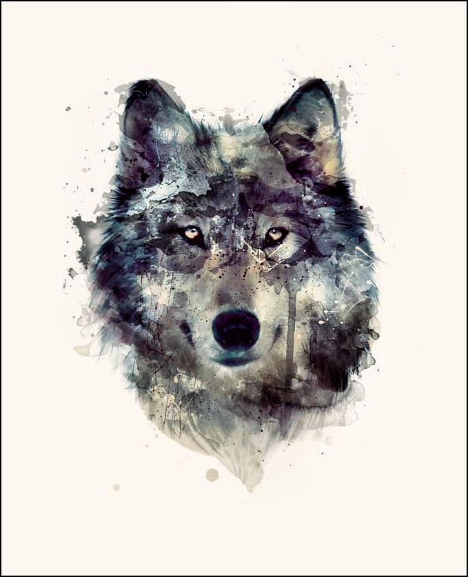
Website: New Merchandise!

The wolf I got from tumblr from someone who had drawn it. I thought it was the ideal picture because it was combined with grey and blue colors compared to loads of other wolves that were drawn in pencil or with pink reddish color.
Below you can see a timelapse of how I created it.
This is a screen recording I did, while creating the T-Shirt, it was also a fundamental Tutorial of how to use the basic tools of Photoshop.
Tuesday 14 March 2017
Rough Cut 12: Throne
This is the 12th rough cut of our music video Throne. In this video I have changed a few slight things such as layering a shot behind the fast paced sequence from 53 seconds onwards. Also, I have added a black and white effect on all of the narrative footage.
This could be a final cut, however the narrative is a bit thin and therefore we will be filming more on Thursday as I will also state in production schedule UPDATE 9.
This could be a final cut, however the narrative is a bit thin and therefore we will be filming more on Thursday as I will also state in production schedule UPDATE 9.
Monday 13 March 2017
SR/BV: DIGIPAK: Back Cover Draft 2
 This is a whole new version of the digipack, since my teacher argued that the digipack draft 1, was a bit clumsy compared to the front cover, I decided to try out the smoke anyway. I also added the track list, record label and barcode, which you can see in the timelapse below. It shows the entire way of how I created this version of the back cover.
Below you can see a timelapse of how Bronwen created the back cover:
Saturday 11 March 2017
Rough Cut 11: Throne
This is the rough cut 11, which I edited after having gotten the feedback from our teacher on rough cut 10. In this rough cut I took the balloon footage out which I created a post on to explain why.
Audience Feedback 9: Throne Rough Cut 10
Today, we had a special session in school, where we were able to show our newest rough cut to our teacher. I showed my latest version, which is rough cut 10 and got the following feedback:
- Add some narrative scenes into the fast paced sequence in the middle of the track when the beat drops
- The layering of the band member in the happy couple scene at 1.15 minutes looks of, try to use a green screen shot instead of the performance shot from the woods for both layering shots
- The protagonist should fall into the pool at 1.20 instead of 1.19 so that it is 100% cut to the beat
- 1.27 minute when he beats his arm in the air should not come back up again during the same shot maybe later by splitting up the pool scene
- 1.38 layering behind the guy maybe band or narrative/ pool shot?
- 1.41 again layering something different e.g. pool shot
- 1.33 different shot the second time he stands with arms looking like cross e.g. pool OR slow-mo running
- 2.09 balloons - take away balloons and put in pool shot
- use the water take more than once in the slow sequence
- dream effect is too much maybe try sepia/black white
- connotation he is drowning he is dying and he is drowning in his own memories
- more bass shot of drums
- crosscutting of drum shots
SR/BV: DIGIPAK: Complete Digipak Version 1

This is the first draft for our complete digipak. Bronwen used a digipak template that she found online and copied it into photoshop.
The feedback we got was that the front cover (hand), was good, but that the back looked quite clumsy in comparison to the hand, so Bronwen should change it. We thought we would then do a back cover with smoke, which I have done a post on.
The feedback from my teacher on the inner pannels was that the image doesn't look like one flowing image, so it would be better to have a single flowing image. He suggested we use a shot of the male protagonist when he is in the water, just so the picture isn't so bare, or maybe layer a band photo onto the pool shot.
Bronwen created the spine using this template rather than in a separate document. The spine was mainly inspired by the spine for "The Resistance" by Muse. She created that the spine was running from the front cover. This was because the main three examples that we looked at had this feature. She felt that it would also flow better from front to back rather than the other way around. She didn't add the logo onto the spine, as i features on the front cover and she thought the name of the band would be enough for the spine. Our spine is also very thin, since we only have 2 inner panels. Digipaks with 3 inner panels would usually have a larger and thicker spine
Balloon Footage: Why we won't be using it

 In Rough Cut 11, I decided to take the balloon footage out and replace it by some narrative footage or band performance. This was because I found that after having added the keyer effect in Final Cut Pro, with the balloons being black, it didn't have the effect that we wanted it to have. There was grey color around the balloons, and you weren't able to see them very well, so I thought I might as well replace it with some other green screen where I could then layer onto. Unfortunately the balloons on the floor didn't work either for the exact same reason. However, the balloons on the floor quality was even worse than the other shot above with the balloons flying around our male protagonist.
 Friday 10 March 2017
BV: DIGIPAK: Final Back Cover
This is the final design for the back cover of our digipak. I discuss what small details and changes were made onthis blogpost.


Audience Feedback 8: Throne Rough Cut 9
This is some audience feedback that we got for out rough cut 9. It was posted on March 3rd, but we asked the Year 10 students to give us feedback the Friday the week after again, because it is good practice for them as well moving on to their IGCSE's.
SR/BV: DIGIPAK: Back Cover: Smoke


 For the back cover, I wanted to include some smoke with color or anyway since our audience feedback argued that the draft 1 was very clumsy, if you compared it to the professional looking front cover. Color is also a big part of our music video, so it seemed like the right thing to do. I tried it out with the colors that were in our music video and then I also used the color tool on Photoshop to try out different colors.
I liked each individual color. However in the end I decided to go for the grey smoke, because the neutral color scheme of it, fit better with our genre and the conventions of rock.
SR/BV: DIGIPAK: Inner Pannels Draft 1

This is the picture that we wanted to have as our inner panels in the digipak. Many of our viewers of the music video also liked this shot, since it is just very special due to the natural appearance of the bubbles and the waves. Al
SR/BV: DIGIPAK: Back Cover Details
There are several things that have to be on the back cover and spine of the digipacks. These include the record label, the copyright symbol, the track list, the barcode, a QR code and even if necessary a parental advisory explicit content symbol.


 Bronwen found a website called barcode generator, where she could create a barcode and a QR code. This was very useful since she was able to create a QR code that would immediately link to our website, when scanned on a smartphone for example. The website also allowed her to type in what she wanted under the barcode, so she typed the usual random numbers in that are under a barcode and added 4 big letters B, M, T, and H for Bring Me The Horizon, which gives it a little extra something, since it becomes more individualised to our own band.


 Bronwen found a website called barcode generator, where she could create a barcode and a QR code. This was very useful since she was able to create a QR code that would immediately link to our website, when scanned on a smartphone for example. The website also allowed her to type in what she wanted under the barcode, so she typed the usual random numbers in that are under a barcode and added 4 big letters B, M, T, and H for Bring Me The Horizon, which gives it a little extra something, since it becomes more individualised to our own band.
 Thursday 9 March 2017
SR/BV: DIGIPAK: Back Cover Draft 1
 After having looked at an example from Muse, as you can see on the left, I decided to try and do something different for the back cover of the digipak rather than the smoke. I liked the blurry, black and white look of this picture and thought it was good, because you see the band members in the left side and then have the possibility to have the track listing on the right side and the barcode, record label etc. below the tracks. Also, I liked the color on the black and white, which I might want to do because then there would still be an element of color on our digipack. This is something we really want to have, since the color powder in our music video plays such a huge role.
  Using Adobe Photoshop, I came up with this version of our digipak. However, our audience feedback didn't like it because it didn't look professional enough. Bronwen, had created the front cover for the digipack first, which our teacher really liked. Then he argued that compared to the front cover this wouldn't be a suitable back cover since it looked a bit clumsy and not professional enough.
Wednesday 8 March 2017
Rough Cut 10: Throne
In this rough cut 10 I have changed quite a lot of small details but also some big ones.


Firstly I have layered some shots onto the narrative part where our couple is still happy. These shots on the left both had really good opportunity for layering, because there was a lot of empty space in the frame. I think the layering is better in the second shot than in the first one, because there is more movement in the first shot, which makes the layering look a bit off and therefore I will probably try to use another shot also to evidence some more shot variety.

However, if we get audience feedback saying that these shots are good, I will leave them the way they are now.
Another change to Rough Cut 9 is that I have put the fast paced sequence that was at the end of the music video when the beat dropped, I have put that in the middle of the music video instead after a beat drops there, because I thought it looked more fitting. Than towards the end I added some more fast paced editing of shots cutting to the beat, which is one of the 6 features of a music video (Andrew Goodwin Theory) and I think it works really well.
via GIPHY
I have tried to achieve full lip-syncing verismilitude in this draft, because that was argued in the audience feedback that it wasn't synced enough. Since, it is one of the common conventions of a music video and one of the first things the audience notices is if it is not in sync.
via GIPHY
I have tried to achieve full lip-syncing verismilitude in this draft, because that was argued in the audience feedback that it wasn't synced enough. Since, it is one of the common conventions of a music video and one of the first things the audience notices is if it is not in sync.
SR/BV: DIGIPACK: Back Cover: Research
 For the back cover, we did some research, looking at several back covers from different bands including Artic Monkey, the 1975 and Bring Me The Horizon themselves.
Doing research about this is necessary, so that I could create a good digipack that achieves versimilitude, and that I would know where to put every little detail such as the barcode, the record label, the tracks and the other CD details.
The one example from BMTH's "That's the Spirit", as you can see it on your left included 11 tracks, the barcode at the top and the record label and copyright details at the bottom. Since our digipak is going to include all of their best tracks so far, we are going to use tracks from each of their 5 albums. The thing that would make the most sense would be to use the songs that have the best hits. We are also going to create our own names for some tracks and invent new tracks, because fans will then be more likely to buy the album. Old albums with old tracks have already been used, so we should make the digipak as if we are trying to access the market with a new album, that fans would buy.
We thought that this back cover is a bit too simplistic, because it is just black. Since we are using colored smoke in the music video we might want to include some either colored smoke or some grey/white colored smoke. Bronwen might also try to use some color effects on the smoke, which I will be doing another post on.
Tuesday 7 March 2017
KO: DIGIPAK: Inspiration (hand)
For our digipak we looked at other band in all genres for inspiration. I thought that the CD cover for Kaleos A/B could look good. The cover is of an x-ray of the 4 band members hands.


This also reminded me of a movie cover for "Identity" (2003) where you have a hand print and each of the fingers is a character in the movie.

Some ideas we could do for this is having one hand in the front with the logo of the band in the middle of the palm and have the faces of each band members on the end of each finger. We could get the hand print from scanning a hand and printing it out and the rest could be done on Photoshop.
Monday 6 March 2017
BV: DIGIPAK: Inner Panels Final
This is the final Draft of the inner panels.
I am happy with the result as I think that it:
-Fits well with the metal core genre
-Ties in very well with the rest of the digipak (front and Back Panels)
-Attractive to our target audience
I created this, like the rest of the digipak, using Adobe Photoshop CS5.
I took this pink smoke effect ( this can be seen on the screen recording for when I made the back cover as I used the same image) from our music video and removed the lead singer from it using the eraser tool. I duplicated the layer a couple of times and then re scaled it and transformed it in order to fill in some gaps.
I also decreased the saturation a lot so that it would fit better.

Subscribe to:
Posts (Atom)